Dear Moderator,
This blog contains G321 work of Thomas Curtis. I worked with Doug Macaskill and Mark Rattigan in order to create an opening sequence for a horror film. Above you will find pages named specifically to help you navigate through my work. I have updated my work in my second year alongside Doug Macaskill, as a result I have added more posts and improved the majority of the old ones. We have also recreated the evaluation website so that it contains our new and improved answers.
Regards,
Thomas Curtis.
Tuesday, 14 April 2015
Sunday, 12 April 2015
Social Media Marketing
We plan on using social media (in this case Twitter) to advertise our product. This will be done by releasing any advertisements onto the Triple Skull Production company account- Triple Skull Ltd. (@TripleSkullLtd).
Our reason for doing this is that other companies do the same, an example of this is Hammer (@hammerfilms); this is a well known, successful horror film production company and therefore it wise to follow there marketing strategies. As well as this, using social media gives us the ability to advertise on a larger scale, cheaply. We hope by doing this, we will reach a larger audience and therefore make more income.

Our reason for doing this is that other companies do the same, an example of this is Hammer (@hammerfilms); this is a well known, successful horror film production company and therefore it wise to follow there marketing strategies. As well as this, using social media gives us the ability to advertise on a larger scale, cheaply. We hope by doing this, we will reach a larger audience and therefore make more income.
Friday, 10 April 2015
The Pyre - Theatrical Poster 2
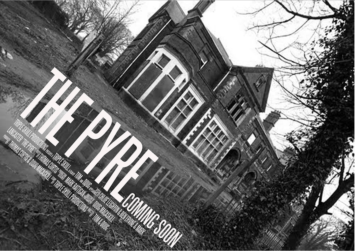
Here is the second theatrical poster design for The Pyre. The design is a black and white canted photo of the main setting of The Pyre. We tried to focus on the main setting to hint towards the films plot without giving away too much information. This poster contains the usual conventions of a movie poster, including the title, a date (or phrase) and information about who is in it.
We created this poster on Photoshop. This consisted of editing the colour and quality of the photo as well as adding text.
Thursday, 9 April 2015
Filming Date Calendar
We decided to have a couple of days to film in both locations, so that we could have plenty of time to get the shots we needed.

Test Footage
The video below shows test footage for some of the shots we planed to use in our final video.
Sunday, 5 April 2015
BBFC Research
BBFC Research from tlcurtis
The information talked about in this presentation is about the BBFC and how we plan to apply their guidelines to our product. Information discussed in this slide show can be found on the BBFC's website.
The information talked about in this presentation is about the BBFC and how we plan to apply their guidelines to our product. Information discussed in this slide show can be found on the BBFC's website.
Friday, 3 April 2015
The Pyre - Theatrical Poster

Here is the first theatrical poster design for The Pyre. The above design is quite simple; a black and white colour combination, which helps set the dark mood of the genre of this piece. We also included a convention found in all poster designs/adverts, in which we have included information on who does what in the film and who is starring in it etc.
We created this poster on Photoshop using a tutorial we made named 'Image In Text'. This consists of the setting to the film inside the the title. The link to the tutorial is below:
http://tomcurtisg324.blogspot.co.uk/2014/06/photoshop-tutorial-to-image-in-text.html
Wednesday, 1 April 2015
New Production Logo
As a group, we decided that we were in need of a new logo and name for our film company. After creating multiple mock ups, we agreed upon the Triple Skull design, as it fit the most with our genre of film and we found it aesthetically pleasing. Below is the new company logo, which we designed on photoshop.

Subscribe to:
Comments (Atom)