Dear Moderator,
This blog contains G321 work of Thomas Curtis. I worked with Doug Macaskill and Mark Rattigan in order to create an opening sequence for a horror film. Above you will find pages named specifically to help you navigate through my work. I have updated my work in my second year alongside Doug Macaskill, as a result I have added more posts and improved the majority of the old ones. We have also recreated the evaluation website so that it contains our new and improved answers.
Regards,
Thomas Curtis.
Tuesday, 14 April 2015
Sunday, 12 April 2015
Social Media Marketing
We plan on using social media (in this case Twitter) to advertise our product. This will be done by releasing any advertisements onto the Triple Skull Production company account- Triple Skull Ltd. (@TripleSkullLtd).
Our reason for doing this is that other companies do the same, an example of this is Hammer (@hammerfilms); this is a well known, successful horror film production company and therefore it wise to follow there marketing strategies. As well as this, using social media gives us the ability to advertise on a larger scale, cheaply. We hope by doing this, we will reach a larger audience and therefore make more income.

Our reason for doing this is that other companies do the same, an example of this is Hammer (@hammerfilms); this is a well known, successful horror film production company and therefore it wise to follow there marketing strategies. As well as this, using social media gives us the ability to advertise on a larger scale, cheaply. We hope by doing this, we will reach a larger audience and therefore make more income.
Friday, 10 April 2015
The Pyre - Theatrical Poster 2
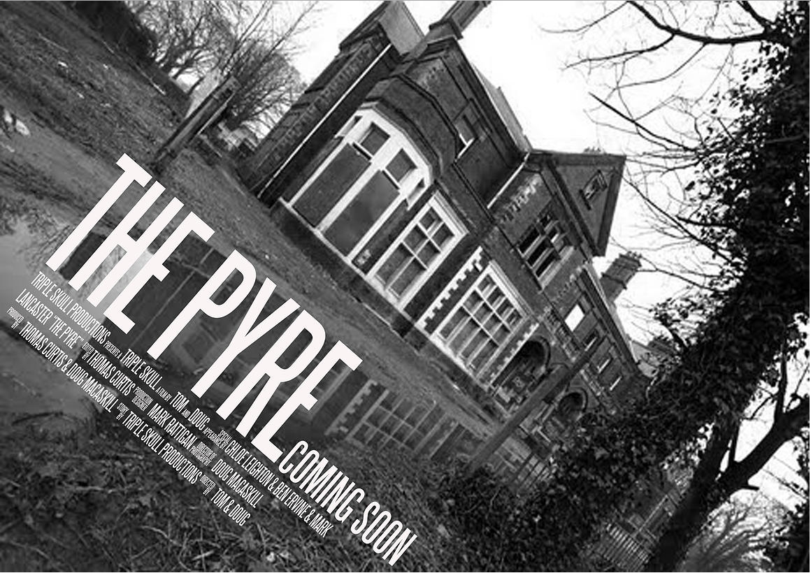
Here is the second theatrical poster design for The Pyre. The design is a black and white canted photo of the main setting of The Pyre. We tried to focus on the main setting to hint towards the films plot without giving away too much information. This poster contains the usual conventions of a movie poster, including the title, a date (or phrase) and information about who is in it.
We created this poster on Photoshop. This consisted of editing the colour and quality of the photo as well as adding text.
Thursday, 9 April 2015
Filming Date Calendar
We decided to have a couple of days to film in both locations, so that we could have plenty of time to get the shots we needed.

Test Footage
The video below shows test footage for some of the shots we planed to use in our final video.
Sunday, 5 April 2015
BBFC Research
BBFC Research from tlcurtis
The information talked about in this presentation is about the BBFC and how we plan to apply their guidelines to our product. Information discussed in this slide show can be found on the BBFC's website.
The information talked about in this presentation is about the BBFC and how we plan to apply their guidelines to our product. Information discussed in this slide show can be found on the BBFC's website.
Friday, 3 April 2015
The Pyre - Theatrical Poster

Here is the first theatrical poster design for The Pyre. The above design is quite simple; a black and white colour combination, which helps set the dark mood of the genre of this piece. We also included a convention found in all poster designs/adverts, in which we have included information on who does what in the film and who is starring in it etc.
We created this poster on Photoshop using a tutorial we made named 'Image In Text'. This consists of the setting to the film inside the the title. The link to the tutorial is below:
http://tomcurtisg324.blogspot.co.uk/2014/06/photoshop-tutorial-to-image-in-text.html
Wednesday, 1 April 2015
New Production Logo
As a group, we decided that we were in need of a new logo and name for our film company. After creating multiple mock ups, we agreed upon the Triple Skull design, as it fit the most with our genre of film and we found it aesthetically pleasing. Below is the new company logo, which we designed on photoshop.

Monday, 16 March 2015
Thursday, 5 February 2015
New Company Title and Logo Ideas
We have chosen to recreate our company logo and title to improve our image, make us more professional and make us seem more like a production company for horror films. This decision will lead to us changing the brand logo and therefore we will have to update previous work to improve the quality and make our products more recognised.
We have narrowed our choices down to a select few ideas. The first is to use a skull as our main logo (as this is a common image in the horror genre) and to therefore name the company around it. From this we have came up with the title Triple Skull Production. The logo will contain three skulls which in the opening to films could laugh, talk or stay still as effects are applied to it.
The second idea is to use the card queen of spades and to names the company something along the lines of Dark Queen Productions. The brand logo would contain a traditional queen of spades card and would mostly use a black and white colours scheme depending on the film and whether it collaborates with another production company.
Our final idea is to combine the two and replace the spades symbol on the card to a skull making the queen of skulls and possibly making the company name Queen of Skulls Pictures, Entertainment or Production. The logo would be similar to the queen of spades idea except it would replace all spades symbols on the card with skulls. If we were to have any type of movement at the opening of the film, the card could flips, the image on the card could move or an effect would just be applied to the picture.
Monday, 2 February 2015
Detailed Poster Research
We have looked at numerous posters in the horror genre and put them on to a pinterest board so that we can analyse them individually using the 500 character maximum provided in the description boxes. We have duplicated certain pins so that we can continue our analyses onto them- giving a more informative description of the posters.
Follow Doug's board Horror Poster Research on Pinterest.
We specifically chose horror films that have similar plots to our movie and contain the same features such as old/large buildings for the seeting and/or ghosts (mainly ones of children). We did this so our research would be valid in helping to create our own poster and so that we can extract features and conventions of our sub-genre of horror.
Wednesday, 28 January 2015
Advert Ideas
We plan on creating multiple adverts in order to drip feed the horror movie to our audience as we feel this is the most effective way to create suspense and get the audience hooked. Below are several ideas that we have for our horror movie advertisements.
Our first idea is of the main location of our opening credits, the abandoned house, with added effects to make the audience focus primarily on the abandoned aspects of the building. The text would be located below the building and only give a bit of such as the title of the movie and a short line saying something a long the lines of Coming Soon. We would probably add filters and effects to this to make it fit the horror genre more.
The second idea is a photo of Adena (our main antagonist) in a dark room without revealing much in order to keep the mystery to what the film is going to be like. She will be stood straight, facing the floor and be wearing the clothes from the film. This picture will contain the title of the film and possibly a slogan.
Another idea is a picture of Adena which is split down the middle, showing her before and after the accident. The backgrounds to the different sides will resemble Adena through lighting- the dead side will be dark while the other will be slightly brighter.
Our next idea is to reveal a short teaser trailer; this will only be between ten and twenty seconds long. It will contain Adena lighting and blowing out a match stick. This will deliberately be done in a way that doesn't reveal too much so that the audience is still slightly questionable about the film. We hope this will cause our target audience to talk about the film more which will lead to publicity by word of mouth.
Finally we plan on releasing a full poster advertisement that
will feature the title (The Pyre), release dates and a tagline. It will contain
the main protagonist and the main location of the film. This advert will be darkened and have burnt effects to show the nature of the background of the antagonist (further linking the advert to the movie).
All of these will use the same font and be similar in imagery by containing similar effects and brightness. We hope these will work for drip feeding our product to the target audience so that we can slowly increase the amount of our viewers and create suspense eventually creating a fan base before the film is even released.
Subscribe to:
Comments (Atom)